

An ad says a lot. This one leaves me disappointed in Converse.
An advertisement is supposed to make you connect with a brand. This one left me wondering how it got approved.
Converse’s ad featuring Karina has drawn criticism over imagery that viewers said reminded them of the Ku Klux Klan and lynching. According to AP, Converse apologized and removed the image from its channels. That response matters, but it doesn’t end the conversation. AP’s reporting
My reaction is simple: this is a terrible advertisement for Converse.
I’m not claiming to know what the photographer, the creative team or Karina intended. I don’t have evidence that anyone deliberately set out to create racist imagery. But an ad can go badly wrong without us being able to prove what was in someone’s head.
The image is what people receive
The campaign image shows Karina holding sneakers while wearing a white skirt. Critics connected the pointed patch of light and the hanging shoes with racist imagery. You can see the image in Cadena SER’s coverage.
People don’t see the planning meeting behind an advertisement. They don’t hear the explanation of the lighting or the concept. They see the finished picture, often for only a few seconds.
That’s why I think a brand has to ask more than whether an image looks interesting. It has to ask what else people might see in it—and whether that interpretation carries a history the campaign team has overlooked.
Not everyone will read an image the same way. That doesn’t make the people who found it disturbing foolish or dishonest. Their response deserves to be heard without being waved away as an overreaction.
Taking it down is a beginning
I’m glad Converse removed the ad and apologized. Leaving it up while dismissing the criticism would have made things worse in my view.
But I’d like to hear what the company learned. How will it review future campaigns? Who gets a chance to flag a concern? Can someone say that an image has a problem without feeling pressured to keep quiet because the campaign is nearly finished?
Those are questions, not claims that I know how this particular approval process worked. I don’t. They’re the questions a response from the company could help answer.
And I don’t think directing abuse at the person in the photograph accomplishes anything. Appearing in an advertisement doesn’t tell us who conceived it, selected the final image or approved its release. My criticism is of the advertisement and the brand’s responsibility for what it publishes.
A brand can do better than damage control
I want companies to listen before a campaign goes public, as well as afterward. Bring in different perspectives. Give concerns a fair hearing. Be willing to change an image even when changing it is inconvenient.
That won’t prevent every disagreement. It can make the review more thoughtful.
Converse chose to publish this advertisement. People were entitled to respond to it. For me, the result was disappointment in a brand that should have put more care into how its message might land.
Taking the image down addresses its continued use. Showing what will change would give the apology more substance.
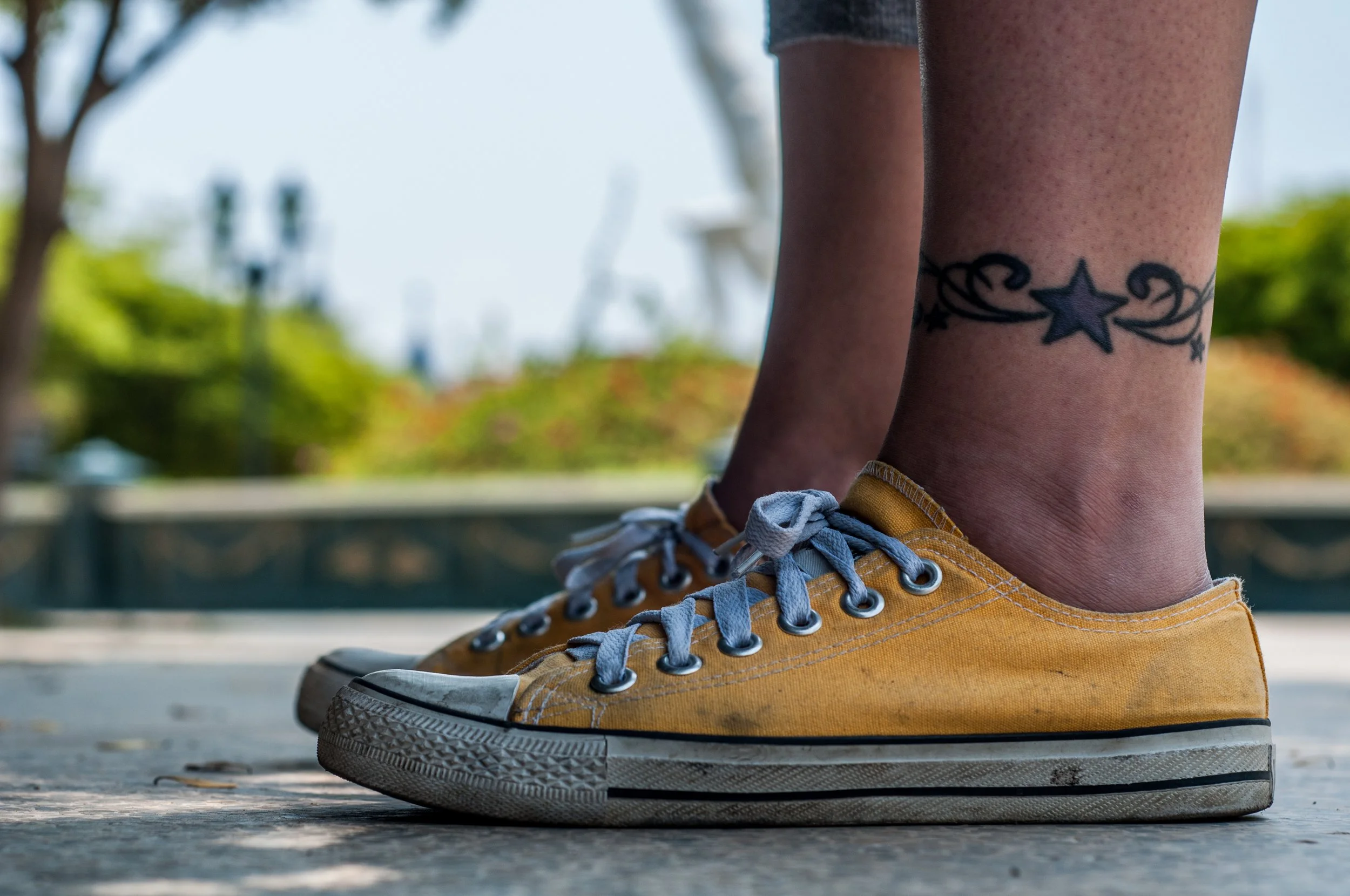
Photo: Yellow Converse shoes, archival contextual photograph from April 6, 2013. This is not the disputed advertisement or the advertised Chuck 70 X model. No connection to the campaign or endorsement by the person pictured is implied. Wilfredor / Wikimedia Commons, CC0 1.0. Platform cropping may apply.
https://commons.wikimedia.org/wiki/File:Converse_Shoes.jpg
https://creativecommons.org/publicdomain/zero/1.0/
