

A menu should help you choose lunch
October 16, 2026 · Mr. Wheels
A restaurant menu has one basic job: help somebody choose what they want to eat. If the print is tiny, the contrast is muddy, or the only option is a QR code that leads to an unreadable image, that job isn’t getting done for everyone.
Today’s meme makes a joke about ordering lunch and getting an eye exam instead. The point underneath it is serious. Access belongs in ordinary moments, including the moment when somebody wants to compare two sandwiches without turning it into a negotiation.
This is an evergreen practical guide, not an announcement of a new rule. My starting point is simple: offer people usable choices, and let them decide what works.
Start with the customer
The U.S. Department of Justice’s effective communication guidance says covered businesses must communicate effectively with people who have communication disabilities. The right support depends on the situation and the person’s usual way of communicating. Examples include large print, accessible electronic information, and a qualified reader. The guidance specifically describes reading a restaurant menu to a blind customer so that customer can choose a dish.
That doesn’t establish one universal menu format for every restaurant. The guidance also explains limits involving undue burden or fundamental alteration. It does establish a useful principle: handing somebody information and making that information usable are different things.
My recommendation is to begin with a straightforward offer: “Would a larger-print menu, an accessible digital version, or having the menu read aloud work better?” Then listen. Don’t guess from a person’s appearance, and don’t assume their companion should answer for them.
Make the ordinary menu easier to use
Restaurants can review their menus before a customer has to point out a problem. Use clear type, strong contrast, and enough space between items. Keep prices close to the dishes they belong to. Avoid putting important information over a busy photograph. Make the specials as readable as the regular menu.
A larger-print version should contain the same choices and current prices. An old copy with crossed-out items creates another problem. Keep the accessible versions in the same update routine as the main menu, and make sure staff know where to find them.
These are practical design recommendations, not a claim that one particular font size solves every person’s access needs. The useful test is whether the customer can get the information they need and make their own decision.
Give the QR code some backup
A digital menu can be convenient. It can also become a dead end if it requires an app, won’t enlarge cleanly, or presents the whole menu as a photograph with no readable text alternative.
I’d like to see restaurants offer a clear web page with actual text, sensible headings, and prices that stay associated with each item. Test it with keyboard navigation, magnification, and a screen reader. Invite feedback from people who use those tools, and act on what they tell you.
Keep another way to order available. A phone battery, mobile signal, or unfamiliar interface shouldn’t decide whether somebody gets to look through the menu. Digital access and a useful paper option can sit alongside each other.
Help without taking over
If someone asks you to read the menu, include the information they request and give them time to consider it. Ask whether they want the whole menu or a section first. Don’t reduce their choices to whatever seems easiest to explain.
Speak to the customer directly. If they use a communication device or need more time to respond, make room for that response. A busy dining room is a reason to prepare staff well, not a reason to rush somebody out of their own conversation.
For customers, a specific request may help: “Could I have the larger-print version?” or “Please read the vegetarian options and prices.” Nobody should have to deliver an accessibility seminar just to order food.
Keep it working
Access needs maintenance. Check menus when prices change. Test the website after an update. Put staff guidance where new employees will actually see it. Treat feedback as information that can improve service.
The goal is an ordinary, enjoyable meal with ordinary choices. People deserve to spend their energy deciding what sounds good, not proving they deserve a menu they can use.
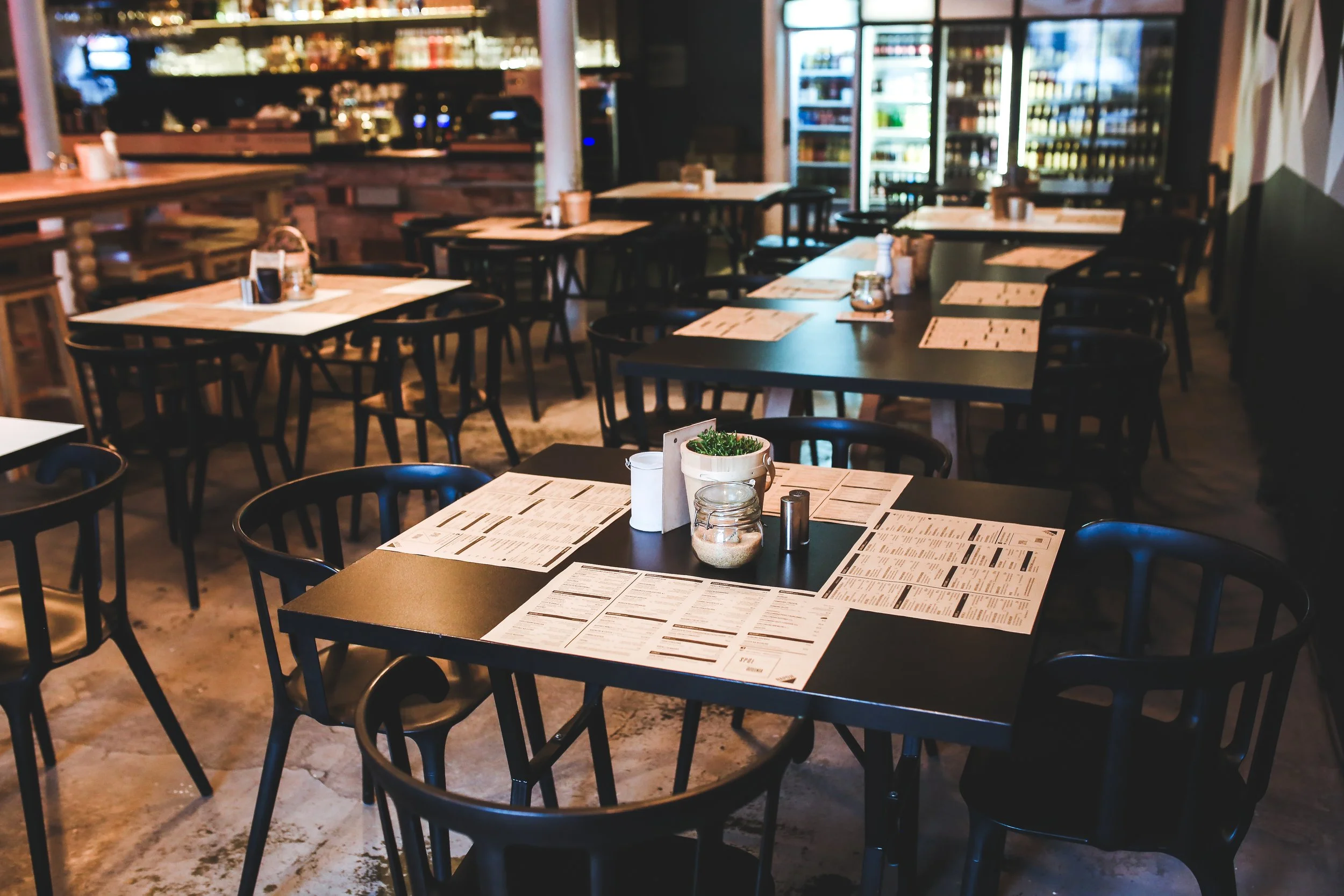
Photo: archival contextual photograph, November 2014; www.Pixel.la Free Stock Photos via Wikimedia Commons, CC0. Metadata credits Karolina Grabowska / STAFFAGE. Source · License.
